Interpreting Incrementality Test Results With Noisy Baselines
How to fix noisy baselines before incrementality tests fall apart.

What a baseline is and what makes it noisy
Half of US brand and agency marketers, 52%, now run incrementality tests as a standard part of measurement. Yet 44% of practitioners say they don't trust the results coming back. That gap has one main cause: most tests that come back flat or unreadable do so because the control group's behavior was never predictable enough to support a clean lift estimate. Fixing the baseline before the test launches is the only real remedy. No amount of post-hoc cleverness rescues a control group that was noisy, biased, or half-blind from the start, and most teams still try anyway.
A baseline is a forecast: what the control group would have done if nothing had changed. Lift is the gap between what happened and what that forecast says would have happened regardless. Get the forecast wrong and the whole test collapses with it, not around the edges but at the root. A sloppy baseline doesn't add a little error at the margins. It can invalidate the entire exercise, and most teams don't find that out until after the budget's spent.
Noise means the baseline's forecast error is large relative to the lift being measured. When that happens, the estimated lift becomes statistically indistinguishable from ordinary week-to-week variance. The test still spits out a number. That number just doesn't mean anything.
Multiple distinct sources of noise cause this, and they behave differently enough that lumping them together is the mistake most practitioners make. Pre-existing volatility, the natural swing in orders or conversion rate from one week to the next, happens before any ad ever runs. Privacy-induced signal loss, from match-rate erosion, attribution-window censoring, and aggregation thresholds, degrades what's observable after the fact. Holdout imbalance means the test and control groups were never equivalent to begin with, so the measured lift is partly just a structural gap between two mismatched groups. Volatility widens the confidence interval. Signal loss creates a zone of pure ambiguity. Holdout imbalance biases the point estimate itself, quietly, and never appears in a p-value.
How pre-existing volatility in conversion data undermines the control group
If weekly conversion volume swings by more than the size of the lift being tested, no statistical method pulls the ad effect out of that background noise. The test is underpowered by design, not by execution. Some tests are dead on arrival no matter how carefully they're run afterward, and volatility is usually the reason. Most teams skip the diagnosis step because it happens before the test launches, and nobody wants to spend two more weeks on setup when the media plan is already approved.
The pre-period is where this gets caught. A substantial window of clean historical data, collected before the test starts, lets an analyst match test and control geos, fit a time-series model, and estimate how much a metric moves on its own in a normal week. Skipping that step means a modest reported lift could be real, or it could be an ordinary Tuesday. There's no way to tell the two apart after the fact.
Two numbers do the actual work of separating a trustworthy pre-test fit from a shaky one: MAPE (mean absolute percentage error) and R-squared. Tests where MAPE stays below 0.15 and R-squared is in the 0.85 to 0.94 range are generally considered to have a trustworthy pre-test fit. Outside that band, confidence erodes fast. Treat these as pass or fail gates, checked before a dollar of test budget moves.
The pre-period used to confirm that test and control markets were tracking together should run at least as long as the test period itself, often longer. More history means a better estimate of natural variance, and a tighter, more honest confidence interval around whatever lift the test eventually reports.
The effect of privacy-induced signal loss on a test's decision boundary
Signal loss is ambiguity. Privacy constraints collapse many different, entirely plausible experimental realities down into the same degraded, observed report, and the report itself cannot tell you which reality actually happened.
The Shekhar/Howard framework on privacy-robust measurement breaks apart the layers doing the damage. Treatment-specific match-rate loss means some conversions in the test group never get matched back to exposure. Segment-specific match-rate loss means matching quality differs across audience segments. Linkability loss means a user's actions across sessions or devices can't be tied together. Attribution-window loss means conversions just outside the measurement window vanish from the count. Aggregation-threshold suppression means platforms won't report numbers below a minimum cell size. Randomized reporting noise means differential-privacy-style noise gets injected deliberately into the output. Each layer degrades the signal on its own, and they compound on top of each other, so the final report is several steps removed from what actually happened.
That compounding produces what the framework calls a decision frontier, and every result falls into one of three zones. In the certify zone, even the most pessimistic reality consistent with the degraded data still clears the business threshold, so the lift is real no matter which scenario actually happened. In the reject zone, even the most optimistic compatible scenario falls short, so the spend clearly isn't incremental. In the unresolved zone, the range of compatible realities straddles the threshold, and no method operating at that signal level can tell a real effect from noise. A number pulled out of the unresolved zone is an artifact of wherever the point estimate happened to land. Nothing more.
This isn't hypothetical: on the Criteo Uplift dataset (several million rows) and the Hillstrom email dataset (about 64,000 rows), clean conversion lift comes back positive in both. On the Criteo Uplift dataset (several million rows) and the Hillstrom email dataset (about 64,000 rows), clean conversion lift comes back positive in both: 0.00112 for Criteo, 0.00495 for Hillstrom. Small, real, measurable effects. But once the analysis introduces finite-sample stress and realistic reporting noise, both datasets are in the unresolved zone. The lift didn't vanish. The ability to certify it at that signal level did, and that distinction is the one most dashboards never make, because a dashboard has no zone for "we can't tell."
How holdout imbalance biases the lift estimate before the test begins
Imbalance is bias, a different animal from volatility or signal loss. If the test and control geos differed structurally going in, different seasonality, different baseline conversion rates, different promotional history, the measured lift absorbs that structural gap along with whatever the ads actually did. No statistical cleverness applied afterward removes bias baked in at setup. This is the source of noise most teams are least equipped to catch, because it never appears as an obvious red flag. It appears as a number that looks fine.
A blunt gut check helps here: could the result be explained just as easily by a 1% background difference between the two groups? If yes, confidence in the headline number should drop immediately, no matter how tidy the p-value looks. Call it the X-factor test, and run it against any result that seems a little too convenient.
Good geo design heads this off before it starts. That means weekly or better sales data at the DMA or postcode level, a clean pre-test history for every market involved, and, where a simple one-to-one geo match isn't available, a synthetic control: mathematically building a control group from a blend of markets whose pre-period trajectory tracks the test group closely enough to serve as a credible counterfactual.
Geo holdout tests carry an underrated advantage in a privacy-constrained environment. The entire result comes from geographic transaction data, no user-level tracking, no device graph, no cookies, which sidesteps most of the signal-loss layers described above. The tradeoff is that holdout imbalance becomes the dominant risk instead of signal loss. Unlike signal loss, that risk is fully addressable at setup. It doesn't have to be lived with afterward, which makes it the more forgivable failure and the less forgivable mistake when teams skip it anyway.
Why platform-reported lift numbers make noisy baselines worse
Platform-reported lift studies grade their own homework, and this is where a lot of "confidence" quietly turns into wishful thinking. Each walled garden runs its own attribution logic, its own conversion windows, its own definition of what counts as incremental, with no shared standard across any of them. Adding up the conversions every platform claims credit for shows the total routinely exceeds the actual number of orders the business processed. That's a structural feature of self-reported attribution, not a rounding error, and it means platform lift numbers should never be the input that calibrates a baseline.
Independent testing has found that platform-reported incrementality figures can drop substantially when cross-referenced against third-party analytics, a gap that, taken at face value, would directly corrupt whatever baseline a brand uses to judge its next test.
Platform-reported ROAS runs consistently hotter than measured incremental ROAS, and the gap is widest on branded search and retargeting: exactly the channels where baseline demand is already highest and where it's easiest to mistake existing intent for ad-driven lift. A platform can be technically accurate about what happened inside its own measurement window and still be wrong about what that means for the business. Local accuracy doesn't guarantee global validity, and treating one as proof of the other is how a noisy baseline gets worse instead of better.
Reading a result when the baseline is imperfect: what confidence looks like
One test result, especially on a high-variance channel, is a signal to look closer, not a verdict to act on. Confidence gets built across multiple test periods. It doesn't get manufactured from a single clean-looking number, no matter how good that number feels in a slide deck.
Different models, run on the exact same dataset, can produce meaningfully different answers. Hiding that disagreement behind a single model creates false certainty: the illusion of precision where none exists. Running several model candidates side by side, selecting based on fit quality, and reporting a range instead of a point estimate gets closer to the truth, even if it's less satisfying to present to a client who wants one number.
Every result should get mapped against the certify, reject, unresolved framework. Landing in the unresolved zone means the honest conclusion is that no method, at the current signal level, can separate lift from noise. The correct response is redesigning the test: a longer pre-period, a cleaner holdout match, coarser segmentation. Reporting the midpoint and moving on, as though it settled anything, is the wrong response and the more common one.
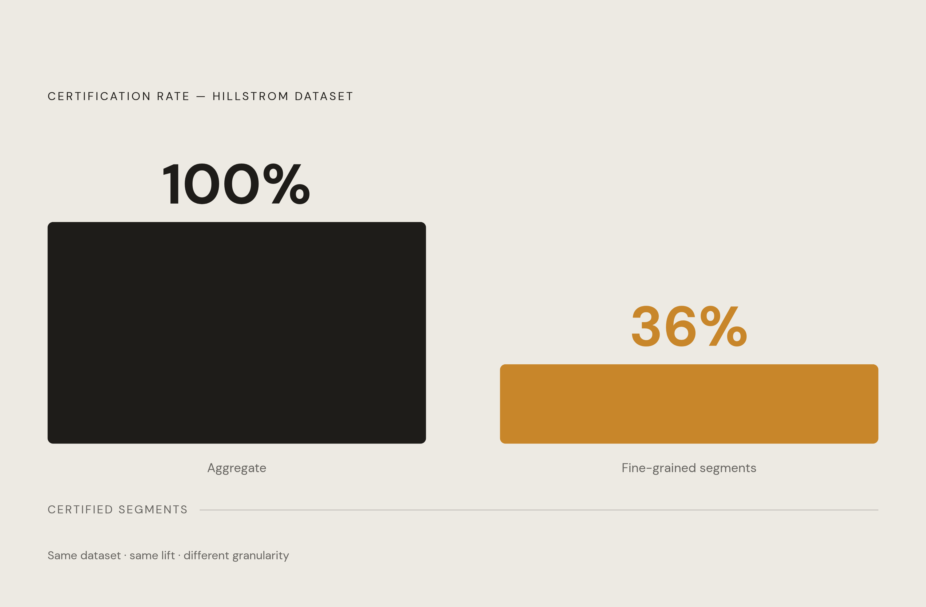
Segmentation choice matters here too. The Hillstrom data makes the point cleanly: certification held at 100% when results were read at a coarse, aggregate level, but dropped to 36% once the analysis sliced down to fine segment cells. Read the aggregate number first when signal is limited, and treat segment-level breakdowns as directional at best, since they don't support acting on them individually.
Practical adjustments that let real lift be read with confidence
Run the MAPE and R-squared audit on historical data before committing to a test design, not after the results land. If MAPE sits above 0.15 or R-squared falls outside 0.85 to 0.94, extend the pre-period or reselect the control markets. Don't proceed on a shaky fit hoping the test will somehow fix it. A shaky fit going in stays a shaky fit coming out, and extending the pre-period or reselecting control markets beforehand is the only way to change that. A shaky fit going in stays a shaky fit coming out.
Where cookie and device-level signal is already degraded, geo holdout testing is the design that survives the environment instead of fighting it, since it strips out the match-rate and linkability losses that create the unresolved zone.
Geo tests earn their keep beyond a single result, too. Feeding their outcomes into an always-on marketing mix model as calibration inputs gives every week of spend an incrementality-adjusted read, without needing a continuous live holdout running in the background.
Multi-touch attribution earns its place for daily pacing decisions. Marketing mix modeling earns its place for annual planning. Incrementality testing, run on a rolling basis, keeps recalibrating what the other two assume, and none of this works as a single tool used alone. Yet relatively few buy-side marketers report using all three together despite how complementary they are on paper. That gap, more than any single statistical fix, is the simplest explanation for why so many practitioners still don't trust the numbers in front of them.